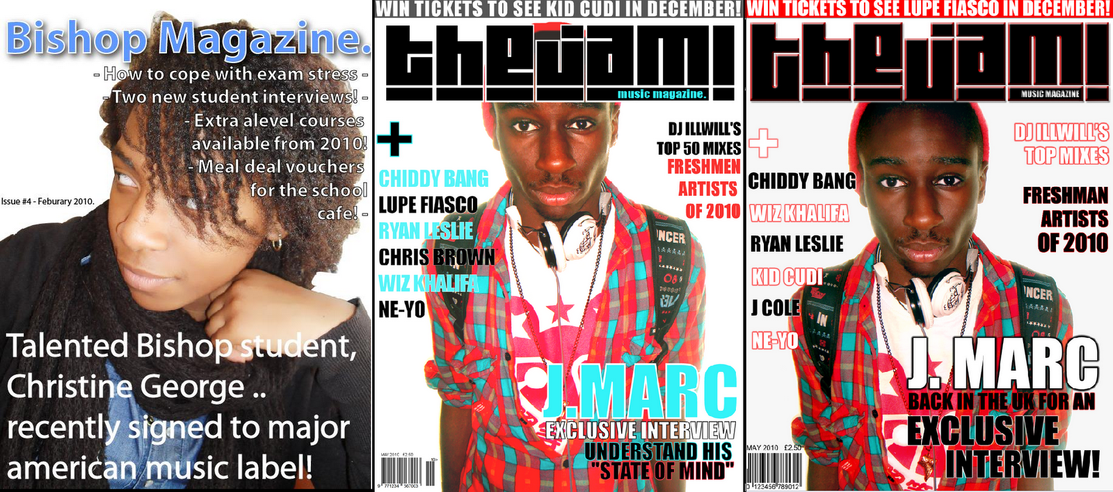
My magazine is directed at a male and female audience, ranging from the ages of 16-20 living in London, and are interested in music in America and the UK. Even though there are many images, my articles are quite detailed and focus on the art of music rather than gossip or celebrity life, which will attract the young adults. My targeted readers are not of one particular race, because R&B and Hip Hop is now universal. The audience I am aiming at are those interested in Underground R&B and Hip Hop, but of course there are links to other popular music because some of the artists are associated with more than one genre such as pop. My cover image is of a young songwriter/artist which helps the audience feel as though they could relate and connect with him, as it is the first focus that the readers’ eyes will be drawn to. The name of the artist is J. Marc which is his real name, not a nickname, so the audience sees the artist positively and because there is no stage name to hide behind, they feel he has nothing to hide; he is an open artist who is sincere and honest. In the article, the artist mentions that he is grateful to all his fans, which evidently makes him seem very humble and likeable. There’s a gap in the market for a magazine like mine, as there are no magazines that focus on underground R&B and Hip Hop, because all the others only concentrate on mainstream R&B and Hip Hop. The colours I have chosen to use reflects the magazine well; it is designed for a young audience and looks attractive to a young adult. Different types of conventions were then used in my media product, to attract this kind of audience and not lead them away to the other competition. Selling points involve prizes, such as tickets to a popular concert will attract a teenager/young adult and they’ll want to participate because younger audiences are interested in shows where it’s a lot more active. I used outlines on my text as it was difficult to read because of the background, and now the outlines catch the eye better, and stands out more.
There are various options for my media product and the distribution, but I chose IPC Media because they claim they are “diverse” and “offers something for everyone”, and when I researched publishers I could tell that it is in fact very diverse, as it publishes magazine varying from homes, music, sport and more. One music magazine it distributes is NME, which even though the genre is rock/indie, I felt there was a gap in their market, as they do not publish any similar magazines to mine, even though they claim to have something for everyone.
From creating my media product I have a new understanding of technologies used in the media industry. I usually use Corel Ultimate X2 to edit photos, and after using Adobe Photoshop CS3 for this first time to make my magazine products, I realised that Photoshop is far more advanced in terms of effects and production. I have far better experience in Adobe Photoshop CS3 and CS4, Microsoft Publisher, and Photography in general. Photoshop has allowed me to do many new things which as deeply aided in the design of my magazine; I am able to edit fonts, colours and images in a much greater effect by editing size, angle, contrast, hue, saturation, threshold levels, colour balance and more to get my desired finish on my product. A blank start allowed me to be as creative as possible, it was relatively easy to learn but some things I had to practice such as cropping and using the pen tool to remove backgrounds. I also used Adobe Illustrator to help me create the simple shapes to add into my magazine, such as a rectangle with rounded corners. Although Illustrator was available to actually make my magazine on, I preferred to use Photoshop and just imported the images I made into Photoshop. Experimenting with both programs allowed me to have clearer understanding of using different types of layers .Using “Blogger” to display my coursework was very useful, because I could edit my work any time I wanted, instead of writing out an essay and then re-writing it out again when I found I made a mistake. Using polls, I have received quick audience feedback by creating questionnaires for those who visit my blog, such as “Which logo appeals to you most?” and this has been very useful, instead of printing out questionnaires and going around the school, which would waste a lot of time. The use of the internet is very helpful because it saved a lot of paper and ink, if I was to print it all out many times. Another form of technology I have used during the creation of my media product is a digital camera. I now understand shots better, using a camera made me consider the framing, and the shot type, the angles and composition of the person.

These images show my early Publisher skills when I didn’t know how to use Photoshop properly. It was very simple and I only used basic shapes, I believe my preliminary task gave me the encouragement to explore and experiment with Photoshop to improve my skills, as I began editing photos and adjusting shapes at an early stage. When I created my preliminary, I did not have the knowledge of how camera shot would’ve affect my work, as the image on my college magazine did not have a direct address with the audience.