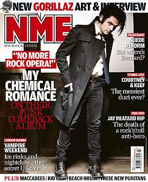
NME standing for "New Musical Express" is a music magazine to promote new artists and genres, targeted at 15-24 year olds that have an interest in new music. The use of the colour red is appealing to the eye and will attract the targeted audience, and the capitals used reflect the powerfulness of this magazine company. The letters stand for "New Musical Express" and they have used short form because it's catchy and easy to remember. Also, if you say it fast, it'll sound like "enemy" which could reflect the rebellion, as it used to be a prestigious magazine and now it's more like a gossip and tabloid magazine. The black background makes the title block seem three dimensional and embossed, this emphasises the importance, while the pointed "M" suggest that the magazine is "cutting edge".
On the front cover, the main image is of Gerard Way, a member of the band, My Chemical Romance, with the anchorage text, "My Chemical Romance, on their punk comeback album". They mention "punk" as regular readers will recognise this genre right away, and "comeback" will attract the audience because they will be interested in reading about their new material, and the magazine is promoting the album release because the new album is highly anticipated by fans. The colour theme is quite dark and emotionless; it is mostly black which will appeal to the audience, the monotone colours are simple while his serious facial expression and studio lighting adds to the inexpressive theme. However, the use of punctuation such as an exclamation mark adds more emotion to the page. The image is of a full body shot, and this shows his style of clothes and it is a stereotype of rock clothing; wearing black and white. And he is tilting to the left and has a direct mode of address with the reader, and this may mean there’s a side of him we do not know and will be revealed within the article and the dark makeup could reflect his unfriendly character. The magazine covers the latest news and puffs that read “Suede Reform”, “Courtney & Keef”, “Jay Reatard RIP” these are in bold capitals while the line underneath telling you more about the article is in normal letters, which are quite short and summarised, this is effective because it catches your eye and it’s easier to scan through; these words show that the magazine is up to date with general music world news. The anchorage text shows a quote from Gerard Way, and this interests the audience because it’s him directing describing his own music to them, not another reviewer or critic saying what they feel about his material. The buzzwords “new” and “plus” informs the audience that there are other artists featured in the magazine, and “plus” automatically makes you think “more” so the readers will think they’re getting more than their moneys worth and also “new” shows the audience that they are up to date with the latest articles. They mention new Gorillaz art and an interview and they are a very well-liked band, this magazine also cover artists that are less-known so they are appealing to a niche market. The logo of the magazine is placed behind the celebrity, so it gives the impression that the magazine cares more about the artists than the actual name of the magazine, because the name of the magazine is already well-known. They feature a variety of different genres as Kid Cudi is a hip-hop artist, and this evidently lets the magazine continue it’s purpose, as being a new music update source. This magazine does not target the audience through freebies, it aims at them by using exclusive interviews, features etc. [INCOMPLETE]