My original photo for my front cover, my model was wearing a dark pink and blue flannel shirt, and this would've clashed with my red house style because red and pink do not compliment each other. I change the temperature, hue, contrast and colour balance to make the shirt darker, thus making it look "redder". This combination of effects worked very well, and I was glad I achieved my desired colour. One thing my peers and teacher realised was that the magazine logo title was cutting off my model's head, which made the cover look squashed, so I used feedback I received and improved the overall look of my cover, I resized the image and moved it down the page. Another thing I changed on my front cover is the blue text; I felt it looked too messy and slightly tacky, so I stuck with a simple Red, Black and White theme.
_____________________________________________

While making my contents page, I realised it looked too boring and flat so I added a gradient effect on my logo, and embossed the date at the top of the page. I liked this effect because the sections could be seen more clearly, and "THEJAM" logo title stands out even more. I added more features on my contents page because it looked too short on my draft, and I wanted my reader to believe the magazine is jam-packed with many featured articles.
_____________________________________________

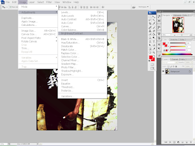
After I merged all the layers into one background, I then started to adjust the brightness settings, the hue and contrast and I managed to add the effects that I wanted without making it difficult to see. I then found out that the background had been cropped off, so using the pen tool, I selected the section of the image I needed, and inserted onto the picture.
_____________________________________________
This is another image I used for my contents page, I wanted to use a similar effect as the photo before, but however, the picture became too dark and the contrast had to be set on a very low level to see clearly, and I wanted a high level contrast. So, I cropped out out my model, and used the navy cross process on the background and added in the body afterwards.
I wanted to make my photographs look very high quality and to accomplish this, I have changed the levels of the image, adjusting the contrast, hue, colour balance, saturation and then finally, added a navy cross process layer. This was a skill I learned this year, while I was experimenting with combining effects on Photoshop CS3.
_____________________________________________
Editing the magazine logo: I felt my logo looked too flat and boring, so I added effects to my magazine logo to make it look more professional. Some effects I have used on the front cover logo were Contour, Outer Glow, Drop Shadow, Bevel and Emboss. I achieved the overall effect of an embossed logo, by merging the layers together after changing the opacity and density of each layer.
_____________________________________________
When I made the quotation a solid red, it looked too bright so I changed the opacity in "Blending Options" I wanted to make my photos on this page, black and white so it wouldn't clash with my red house style. I liked this effect because the saturated colours make the red highlights stand out even more.
_____________________________________________
Logo stamp in the corner of the poster page: the whole logo of "THEJAM" did not fit in and when I scaled it down, it looked very squashed so I abbreviated it, and made a whole new logo, which I used on both image pages. The logo looks neater now, and the T and J reflects each other which looks like a mirrored image, I wrote "THE JAM" on the underline, so the readers can know for sure what it says, because it might have hard to read. Also, I added shadow and embossing effects to make the logo look three dimensional, and making it stand out more. It's important to put the logo on the poster because this is a page that readers may want to rip out and stick on their walls, and they will have no reference to the magazine, if they were to forget.
_____________________________________________

The quotation in the on the side had to moved into the middle because I wanted that quote be emphasised as much as possible, as it reflects my artists personality, and the audience can understand that he is a dedicated worker. I added outlines and glowing effects to this quotation and the one on the previous poster page so the layout can be continuous.
_____________________________________________


