When creating my music magazine, “The Jam”, I researched many different magazines to understand how pages are arranged, which helped me recognise different conventions of a music magazine. One main feature I noticed was the position of title, all the successful magazines place their bold logo at the top of the page, where it is easily identified. I have aimed to maintain a professional look by using several features from successful established magazines such as Vibe and NME, such as a house style font and layout. I used a typical feature of a central image on a cover is a direct mode of address, which gives a personal approach to the audience. Some magazines use collages of images on their cover, but I felt this would’ve looked too messy and unprofessional, so I just used one image so the main focus would be very clear. Cover stories are located at the bottom right, and I wanted a short one-liner, which doesn’t reveal much so the readers will want to know more; this kind of convention has worked well with other magazines. I kept to the original house style throughout the front cover, contents and article page because most magazines have a colour theme, which helps keep the issue consistent rather than look too unorganised, so I have only used three different colours; white, black and red. My contents page is quite easy to read through, as there are two sections “Features” and “Regulars” which helps the audience navigate through the page easily. I was inspired by RWDMAG (Rewind Magazine) to use a large image as a poster on my article pages, and have used a smaller image of the same artist the in corner of the page, so I had a contrast in the sizes of images. I have used buzzwords such as “WIN” and “EXCLUSIVE” to attract the reader, just as other magazines have, and also added a “+” plus sign, and listed artists that will be featured in the magazine, which makes the audience think they are getting more for their money’s worth.
My magazine is directed at a male and female audience, ranging from the ages of 16-20 living in London, and are interested in music in America and the UK. Even though there are many images, my articles are quite detailed and focus on the art of music rather than gossip or celebrity life, which will attract the young adults. My targeted readers are not of one particular race, because R&B and Hip Hop is now universal. The audience I am aiming at are those interested in Underground R&B and Hip Hop, but of course there are links to other popular music because some of the artists are associated with more than one genre such as pop. My cover image is of a young songwriter/artist which helps the audience feel as though they could relate and connect with him, as it is the first focus that the readers’ eyes will be drawn to. The name of the artist is J. Marc which is his real name, not a nickname, so the audience sees the artist positively and because there is no stage name to hide behind, they feel he has nothing to hide; he is an open artist who is sincere and honest. In the article, the artist mentions that he is grateful to all his fans, which evidently makes him seem very humble and likeable. There’s a gap in the market for a magazine like mine, as there are no magazines that focus on underground R&B and Hip Hop, because all the others only concentrate on mainstream R&B and Hip Hop. The colours I have chosen to use reflects the magazine well; it is designed for a young audience and looks attractive to a young adult. Different types of conventions were then used in my media product, to attract this kind of audience and not lead them away to the other competition. Selling points involve prizes, such as tickets to a popular concert will attract a teenager/young adult and they’ll want to participate because younger audiences are interested in shows where it’s a lot more active. I used outlines on my text as it was difficult to read because of the background, and now the outlines catch the eye better, and stands out more.
There are various options for my media product and the distribution, but I chose IPC Media because they claim they are “diverse” and “offers something for everyone”, and when I researched publishers I could tell that it is in fact very diverse, as it publishes magazine varying from homes, music, sport and more. One music magazine it distributes is NME, which even though the genre is rock/indie, I felt there was a gap in their market, as they do not publish any similar magazines to mine, even though they claim to have something for everyone.
From creating my media product I have a new understanding of technologies used in the media industry. I usually use Corel Ultimate X2 to edit photos, and after using Adobe Photoshop CS3 for this first time to make my magazine products, I realised that Photoshop is far more advanced in terms of effects and production. I have far better experience in Adobe Photoshop CS3 and CS4, Microsoft Publisher, and Photography in general. Photoshop has allowed me to do many new things which as deeply aided in the design of my magazine; I am able to edit fonts, colours and images in a much greater effect by editing size, angle, contrast, hue, saturation, threshold levels, colour balance and more to get my desired finish on my product. A blank start allowed me to be as creative as possible, it was relatively easy to learn but some things I had to practice such as cropping and using the pen tool to remove backgrounds. I also used Adobe Illustrator to help me create the simple shapes to add into my magazine, such as a rectangle with rounded corners. Although Illustrator was available to actually make my magazine on, I preferred to use Photoshop and just imported the images I made into Photoshop. Experimenting with both programs allowed me to have clearer understanding of using different types of layers .Using “Blogger” to display my coursework was very useful, because I could edit my work any time I wanted, instead of writing out an essay and then re-writing it out again when I found I made a mistake. Using polls, I have received quick audience feedback by creating questionnaires for those who visit my blog, such as “Which logo appeals to you most?” and this has been very useful, instead of printing out questionnaires and going around the school, which would waste a lot of time. The use of the internet is very helpful because it saved a lot of paper and ink, if I was to print it all out many times. Another form of technology I have used during the creation of my media product is a digital camera. I now understand shots better, using a camera made me consider the framing, and the shot type, the angles and composition of the person.
These images show my early Publisher skills when I didn’t know how to use Photoshop properly. It was very simple and I only used basic shapes, I believe my preliminary task gave me the encouragement to explore and experiment with Photoshop to improve my skills, as I began editing photos and adjusting shapes at an early stage. When I created my preliminary, I did not have the knowledge of how camera shot would’ve affect my work, as the image on my college magazine did not have a direct address with the audience.
Sunday, 4 April 2010
Mid-Production Screencaps: Final Adjustments
My original photo for my front cover, my model was wearing a dark pink and blue flannel shirt, and this would've clashed with my red house style because red and pink do not compliment each other. I change the temperature, hue, contrast and colour balance to make the shirt darker, thus making it look "redder". This combination of effects worked very well, and I was glad I achieved my desired colour. One thing my peers and teacher realised was that the magazine logo title was cutting off my model's head, which made the cover look squashed, so I used feedback I received and improved the overall look of my cover, I resized the image and moved it down the page. Another thing I changed on my front cover is the blue text; I felt it looked too messy and slightly tacky, so I stuck with a simple Red, Black and White theme.
_____________________________________________
While making my contents page, I realised it looked too boring and flat so I added a gradient effect on my logo, and embossed the date at the top of the page. I liked this effect because the sections could be seen more clearly, and "THEJAM" logo title stands out even more. I added more features on my contents page because it looked too short on my draft, and I wanted my reader to believe the magazine is jam-packed with many featured articles.
_____________________________________________
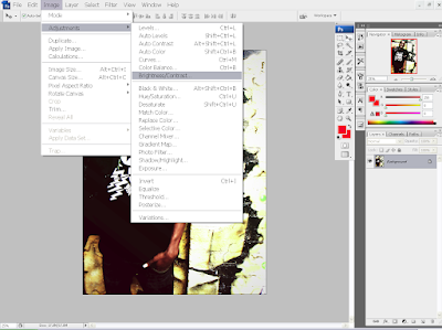
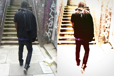
After I merged all the layers into one background, I then started to adjust the brightness settings, the hue and contrast and I managed to add the effects that I wanted without making it difficult to see. I then found out that the background had been cropped off, so using the pen tool, I selected the section of the image I needed, and inserted onto the picture.
_____________________________________________
This is another image I used for my contents page, I wanted to use a similar effect as the photo before, but however, the picture became too dark and the contrast had to be set on a very low level to see clearly, and I wanted a high level contrast. So, I cropped out out my model, and used the navy cross process on the background and added in the body afterwards.
I wanted to make my photographs look very high quality and to accomplish this, I have changed the levels of the image, adjusting the contrast, hue, colour balance, saturation and then finally, added a navy cross process layer. This was a skill I learned this year, while I was experimenting with combining effects on Photoshop CS3.
_____________________________________________
Editing the magazine logo: I felt my logo looked too flat and boring, so I added effects to my magazine logo to make it look more professional. Some effects I have used on the front cover logo were Contour, Outer Glow, Drop Shadow, Bevel and Emboss. I achieved the overall effect of an embossed logo, by merging the layers together after changing the opacity and density of each layer.
_____________________________________________
When I made the quotation a solid red, it looked too bright so I changed the opacity in "Blending Options" I wanted to make my photos on this page, black and white so it wouldn't clash with my red house style. I liked this effect because the saturated colours make the red highlights stand out even more.
_____________________________________________
Logo stamp in the corner of the poster page: the whole logo of "THEJAM" did not fit in and when I scaled it down, it looked very squashed so I abbreviated it, and made a whole new logo, which I used on both image pages. The logo looks neater now, and the T and J reflects each other which looks like a mirrored image, I wrote "THE JAM" on the underline, so the readers can know for sure what it says, because it might have hard to read. Also, I added shadow and embossing effects to make the logo look three dimensional, and making it stand out more. It's important to put the logo on the poster because this is a page that readers may want to rip out and stick on their walls, and they will have no reference to the magazine, if they were to forget.
_____________________________________________
The quotation in the on the side had to moved into the middle because I wanted that quote be emphasised as much as possible, as it reflects my artists personality, and the audience can understand that he is a dedicated worker. I added outlines and glowing effects to this quotation and the one on the previous poster page so the layout can be continuous.
_____________________________________________
Saturday, 27 March 2010
Feature Article
It's hard to believe what people can accomplish given the right surroundings. J Marc is at a level most of us will only dream of. He broke into the recording industry as a songwriter, penning the hit "Nothin’ On You" for Bruno Mars. The single's successful release in the United States prompted an informal meeting between J. Marc and Jive/Zomba’s label head, and signing a recording contract but he had to refuse the deal because of complications with his mother falling ill at the time. He continued writing songs, and singing demos for popular artists and Island Records then signed him a year later.The Jam caught up with the J Marc over the past month, and had a small chat with him about his upcoming projects. Having penned, and still writing hits for some of today's biggest musical names, the man is concentrating on applying the finishing touches to his own debut which has reportedly had over 100 songs recorded for it. J Marc is currently on tour with American Grammy-Award winning singer-songwriter and record producer, The Dream and will be releasing his debut "State of Mind" at the end of July.
The Jam: Hey, J Marc. Welcome back to London, welcome home!
J. Marc: Thank you! It’s just been so hectic in the States. London seems so much more relaxing, it’s great to be back. It’s quite relieving actually.
The Jam: But you can’t get away from the limelight! We’re all really psyched for you, congratulations on getting to the Top 5 in the US Charts!
J. Marc: (laughs) I appreciate all the support from all the fans, and I know everyone says this but I really couldn’t have done it without you guys. It’s so surreal, seriously. This time two years ago, I was just a normal guy, writing lyrics in my spare time. It’s absolutely unbelievable. I’m always starstruck when I collaborate with artists I’ve always looked up to, always seen on TV and admired you know?
The Jam: We’ve watched your progress; it’s like seeing a kid grow up to be a genius, we’ve always known you had potential! Speaking of working with big artists, You recently collaborated with rapper Shad K – can you tell us about how that came about and how it went?
J. Marc: He’s always been one of my favourite rappers. I’m not exactly sure how we got hooked up, it was through his people and my people. We were moving around a lot in New York and the name is getting out there. I’ve always listened to his stuff, even since he was still underground. But he’s a real cool dude, he’s an amazing artist aswell. He’s truly inspirational.
The Jam: After the first deal didn't work out was there ever a time when you thought about pursuing another career or did you always know music was for you?
J. Marc: Until I was about 15, I'd always wanted to be a doctor. And then one day, in an English lesson, the teacher told me I had talent. Poetry, and writing were things I did for fun, for entertainment in my spare time. So when the first deal with Zomba didn't work out, I was always on the fence about the music industry. I wanted to stay around it. I just didn't know what capacity I could stay around it and the opportunity to write for Chris Brown just presented itself. But yeah, as I said, writing is something I do anyway. With or without a deal.
The Jam: How often do you write? Is it forced, or is it mainly taken from previously written material after emotional intense moments?
J. Marc: I write pretty much every single day. It’s like a daily routine. Inspiration comes from anywhere and everywhere. As long as I’m breathing, as long as there’s people on this earth, there’s always gonna be somethin’ to write about. I’ve never had to recycle songs or topics, but the English language is so vast, there’s so many different ways to say the same thing – so there’s always a song to be written.
The Jam: What advice he would give to songwriters and artists who are trying to break into the music business?
J. Marc: For songwriters, I would say to continue to work on your melodies, and tell the best stories you can. Get with talented producers who can create the tracks and who are already working on projects. For artists, stay persistent and don’t quit. It can be a long journey trying to make it as an artist. When it happens, it happens.
The Jam: How do you feel about having other people that you’ve written for being more credited and recognised for your words that you?
J. Marc: I don’t mind at all to be honest, I wrote the song and the artists know I wrote the song, it’s just that the world doesn’t know yet. It doesn’t bother me. As long as the world hears the song, and likes it, it’s just like it’s me up there, accepting that award or whatever. It’s the same thing to me. I've written over one hundred or so songs, so it really doesn't matter. I'm concentrating on my album now.
The Jam: We are looking forward to the release of your debut. Could you tell us who’s going to be featured on your album?
RL: The concept of the album was to be self contained, and I was going to put out the album with no features at all and it just so happens that just a couple of weeks ago, we were playing with some ideas in the studio and we came up with a song called “Move Along”. That represents the only feature on my album and I figured if we are going to do features we are going to go all the way with it. That's when I called my good friend and collaborator Chris Brown. I played the record for him in the studio and he responded to it really positively, he went in and did his thing and now thats the only track to have a feature ... and it has a double feature, featuring Chris Brown and Fabolous.
The Jam: Thanks for the interview, before we end is there anything you would like to tell our readers?
J. Marc: I think we touched on everything. But I would like to thank you for featuring me. I hope that I continue to, as an artist, to provide and create material that is trustworthy and from an artistic standpoint.
J. Marc's album "State of Mind" is out on the 25th of July.
Friday, 26 March 2010
Photoshoot
I have decided to use my friend Kojo as my model, so I had to email him to arrange a date and time. We took the photos on the 23rd of February 2010, at 2:30pm and 24th February 2010, 11:00am, I have chosen these days because it had just rained a few days before, I checked the weather forecast and it said the air would be damp but only light rain. I thought this was perfect, because the rain made the brickwall and the floor darker, which I could edit in Photoshop later, which could be a very good contrast effect. The first arranged day, we have chosen a costume which is very bright and represent the young generation in a good light. I have chosen the colour of his shirt, hat and trainers to be red because it will go with my housestyle, and his headphones show that music is one of his passions. The images were taken in Embankment, and Cheshire Street, Brick Lane E1. I chose these locations because I liked the graffiti in the background, and the brick wall and stairs had very good lighting. The second day of the photoshoot was the main day because we had more time to take the photos; we took photos in Brick Lane, Commercial Street, Liverpool Street, Wentworth Street, and Hanbury Street. The costume chosen on this day was very smart, i wanted to give him a R&B look; a black blazer and black trainers. The photoshoot lasted two days overall, and I am pleased with the results. Here are some of the photographs I have taken:
Friday, 12 February 2010
Results.
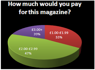
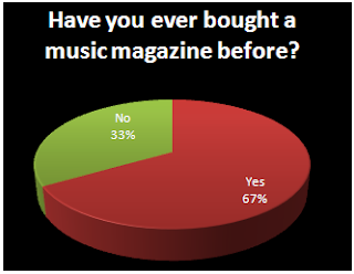
I gave my questionnaire to 15 people and I calculated the results, and this will help me plan my work. 40% of the survey takers preferred not to have new artists featured, but a larger amount were interested so I will do articles featuring some up and coming artists, but not too many because it’ll bore the 40% that are not interested. 7 out of 15, almost 50% of people I gave this questionnaire to are mostly interested in R&B; I have decided to do a magazine based on this genre of music so that it’ll have a more popular response. Pop is the second favourite option so I’ll include some pop aswell, because quite a few artists can come under all three categories; Pop, R&B and Hip Hop. Almost half like to read in-depth articles so I will be including equally amount of images, short articles and in-depth articles so there's something to suit everyone's needs. I will make the price of my magazine £2.50 because it's in the range that people have chosen. I will include posters in my magazine and maybe a CD but not any stickers, because it seems childish. My results show that most people prefer a monthly magazine so I will release the magazine once a month; this will benefit the company by having more time to ensure the magazine has all the latest news, because if it was weekly, the magazine may run out of things to talk about during that week. The people I asked said they read Vibe, so I will use it as a guideline for my work. They also said that the front cover attracts them to a magazine the most, so I will spend a substantial amount of time planning this cover to make it appealing to the targeted audience.
Subscribe to:
Posts (Atom)