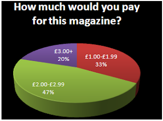
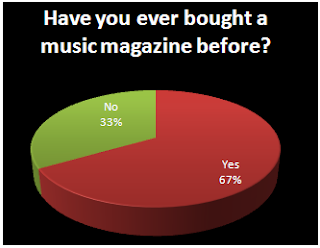
I gave my questionnaire to 15 people and I calculated the results, and this will help me plan my work. 40% of the survey takers preferred not to have new artists featured, but a larger amount were interested so I will do articles featuring some up and coming artists, but not too many because it’ll bore the 40% that are not interested. 7 out of 15, almost 50% of people I gave this questionnaire to are mostly interested in R&B; I have decided to do a magazine based on this genre of music so that it’ll have a more popular response. Pop is the second favourite option so I’ll include some pop aswell, because quite a few artists can come under all three categories; Pop, R&B and Hip Hop. Almost half like to read in-depth articles so I will be including equally amount of images, short articles and in-depth articles so there's something to suit everyone's needs. I will make the price of my magazine £2.50 because it's in the range that people have chosen. I will include posters in my magazine and maybe a CD but not any stickers, because it seems childish. My results show that most people prefer a monthly magazine so I will release the magazine once a month; this will benefit the company by having more time to ensure the magazine has all the latest news, because if it was weekly, the magazine may run out of things to talk about during that week. The people I asked said they read Vibe, so I will use it as a guideline for my work. They also said that the front cover attracts them to a magazine the most, so I will spend a substantial amount of time planning this cover to make it appealing to the targeted audience.
Friday, 12 February 2010
Questionnaire and Proposal.
PROPOSAL.
The genre I have chosen for my music magazine is R&B jams, but also featuring Hip Hop and Pop too because some of the artists are associated with more than one genre. R&B was the most popular on my questionnaire aswell, so I know the target audience will be easier to attract. The target audience for my magazine will be mostly females ages 15-20 because my survey proved that my audience prefers the genre I have chosen. The magazine is needed in the market because there are not any successful magazines focussed on R&B jams, ballads or just downtempo songs.
QUESTIONAIRE.
What type of music are you most interested in?
C
Do you prefer only well-known artists on the front cover?
Yes: No:
How often would you recommend this magazine is released?
Weekly: Fortnightly: Monthly:
How much would you pay for this magazine?
_______________________________________________
What kind of freebies would you like most to come with a magazine?
Stickers: CD’s: Posters:
Do you enjoy reading in depth articles?
Yes: No:
Are you interested in up and coming artists as well as famous ones?
Yes: No:
What attracts you most to a music magazine?
The front image: The articles featured on the cover: Special price offers Freebies
Have you ever bought a music magazine before?
Yes: No:
If yes, which ones:
_______________________________________________C
Do you prefer only well-known artists on the front cover?
Yes: No:
How often would you recommend this magazine is released?
Weekly: Fortnightly: Monthly:
How much would you pay for this magazine?
_______________________________________________
What kind of freebies would you like most to come with a magazine?
Stickers: CD’s: Posters:
Do you enjoy reading in depth articles?
Yes: No:
Are you interested in up and coming artists as well as famous ones?
Yes: No:
What attracts you most to a music magazine?
The front image: The articles featured on the cover: Special price offers Freebies
Have you ever bought a music magazine before?
Yes: No:
If yes, which ones:
Q Magazine Article Feature Analysis
The main artist featured in this article is Chery Cole, and this may be aiming at a target audience of males that find her attractive or females that aspire to be like her. And because it is an in-depth article consisting of 9 pages, this suggests that the target audience is in the age range of mid 20s, because they are more likely to have a better attention span rather than younger readers who prefer to see more photographs and also they use strong language which won't be suitable for minors, but 3 out of 9 pages of the article have full images which helps the reader not lose interest.
The first double page is an introduction to the article; the first showing a long shot of Cheryl, this allows the reader to see her full physique and body language, slightly arching her back, looking down at the camera and her hands grasped, showing power and courage, that she is not afraid and is ready for anything. Her costume is ripped and there are sharp studs, suggesting fierceness and represents the "rock" image to blend in with the other artists in the magazine, and the ripped clothing is almost as if she has survived a vicious battle, and the clothes she wears are showing that she is a trendsetter, and a fashion style icon. The location of this shoot, suggests that she is on top of the world, with everyone looking up at her. The main colours used are black and red, while the rain adds to the effect of her looking strong and evil. The second page has a large "X" scrawled across it, which could represent Cheryl marking her spot, marking her territory. The words "Pin-Up, Player, Fighter, Superstar" shows the way Q Magazine wants the readers to see her, and "All Hail" describes her as if she is a queen. Her name is highlighted in red, and there is an ellipsis to make the reader want to turn the page and read on.
The next double page shows Cheryl indoors, with a white background, and wind blowing in her hair with the same costume, and the other images article generally shows Cheryl as an attractive woman, as she was crowned The World's Sexiest Woman 2009 by FHM. The photographs show her pouting and showing her as being appealing to the audience. The style of these photographs are similar to the style of the movie Sin City, a movie the magazine's audience will be familiar with, which helps her blend in and get rid of her "pop" image she previously had with Girls Aloud. The background behind the text is a large "C" and the layout is somewhat similiar to a newspapers' and does not look trashy by being untidy. The article shows quotes from Cheryl, to make the article seem more personal and as if she is talking to the reader, and these quotes will be remembered. The article is formal and the syntax used is advanced so this adds on to the fact that this article is not aimed at minors. The signature layout of Q Magazine is black and red, and this can be seen as a housestyle because of the article's main colour theme. The captions on the photos are light jokes, which help the reader not take the whole article too seriously.
NME Contents Page Analysis
The NME Magazine contents page is comparable to one of a newspaper, with similar font and layout, and the caption for the photo looks like a cutout from a newspaper article. There is a big image of a band, Blur, and it is the main focus of this page. The men’s body language is very friendly with each other because they have been reunited once again and not quite looking directly at the reader, they are posing for other cameras, this connotes the type of relationship they want with others; a laid back chilled attitude.
From just looking at the front cover and contents, this magazine is all about promoting artists, including My Chemical Romance and Blur. On the bottom right hand corner, there is a small image of the January 2010 issue, which is at a discounted price; this evidently shows that this magazine could be seen as a collectors item, because they are still sell their other issues. Also, it says “save up to 36%” which is a promotional offer, to get people to subscribe to the magazine, and will appeal to those who want to save money, seeing as we are in the recession.
On the left hand side, only about 1/6th of the page, is a strip which also looks like a cutout from a newspaper, and is arranged in alphabetical order. It is a list of artists featured in the magazine, rather than categories such as interviews or posts, they have done this to make it easier for the reader to find the articles about the artists they like.
They have used a simple red, white and black colour theme, which each individual colour is bold and still goes together well. These colours are the same as the ones on the cover, and a house style has been made. The logo is in the top right corner, and it is only small because the magazine only cares about the artists, rather than their name.
NME Magazine Analysis.
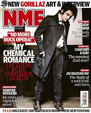
NME standing for "New Musical Express" is a music magazine to promote new artists and genres, targeted at 15-24 year olds that have an interest in new music. The use of the colour red is appealing to the eye and will attract the targeted audience, and the capitals used reflect the powerfulness of this magazine company. The letters stand for "New Musical Express" and they have used short form because it's catchy and easy to remember. Also, if you say it fast, it'll sound like "enemy" which could reflect the rebellion, as it used to be a prestigious magazine and now it's more like a gossip and tabloid magazine. The black background makes the title block seem three dimensional and embossed, this emphasises the importance, while the pointed "M" suggest that the magazine is "cutting edge".
On the front cover, the main image is of Gerard Way, a member of the band, My Chemical Romance, with the anchorage text, "My Chemical Romance, on their punk comeback album". They mention "punk" as regular readers will recognise this genre right away, and "comeback" will attract the audience because they will be interested in reading about their new material, and the magazine is promoting the album release because the new album is highly anticipated by fans. The colour theme is quite dark and emotionless; it is mostly black which will appeal to the audience, the monotone colours are simple while his serious facial expression and studio lighting adds to the inexpressive theme. However, the use of punctuation such as an exclamation mark adds more emotion to the page. The image is of a full body shot, and this shows his style of clothes and it is a stereotype of rock clothing; wearing black and white. And he is tilting to the left and has a direct mode of address with the reader, and this may mean there’s a side of him we do not know and will be revealed within the article and the dark makeup could reflect his unfriendly character. The magazine covers the latest news and puffs that read “Suede Reform”, “Courtney & Keef”, “Jay Reatard RIP” these are in bold capitals while the line underneath telling you more about the article is in normal letters, which are quite short and summarised, this is effective because it catches your eye and it’s easier to scan through; these words show that the magazine is up to date with general music world news. The anchorage text shows a quote from Gerard Way, and this interests the audience because it’s him directing describing his own music to them, not another reviewer or critic saying what they feel about his material. The buzzwords “new” and “plus” informs the audience that there are other artists featured in the magazine, and “plus” automatically makes you think “more” so the readers will think they’re getting more than their moneys worth and also “new” shows the audience that they are up to date with the latest articles. They mention new Gorillaz art and an interview and they are a very well-liked band, this magazine also cover artists that are less-known so they are appealing to a niche market. The logo of the magazine is placed behind the celebrity, so it gives the impression that the magazine cares more about the artists than the actual name of the magazine, because the name of the magazine is already well-known. They feature a variety of different genres as Kid Cudi is a hip-hop artist, and this evidently lets the magazine continue it’s purpose, as being a new music update source. This magazine does not target the audience through freebies, it aims at them by using exclusive interviews, features etc. [INCOMPLETE]
Q Magazine Analysis.
"Q" is a music magazine, based on interviews with popular artists and in-depth stories. The targeted audience are males ages 24-44, and they would have broad ranges of music; this is evident from the featured articles on a wide range of acts such as John Lennon and The White Stripes, and this shows that the audience is interested in these acts so they'd like to read alot about them. There is a puff that says "The Best New Acts" and this is the first issue of 2010, and the magazine will predict which acts are going to be successful during this New Year. Regular readers will be attracted to this feature because they'd like to know about upcoming music artists and it makes the magazine more interesting, instead of showing the same old familiar faces.
From the front cover, the magazine evidently features a wide range of artists as quite a few well-known recognisable artists are mentioned like Muse, John Mayer and 50 Cent. It targets males ages 24-44, but of course women read it too. Magazine features are more in-depth, and artists are more serious, so bands such as McFly wouldn't be featured, so the readership is older. "Q" also sounds "Cue" as in the sense of queuing a record, ready to play which adds to the aspect of the magazine, and it is a shortened version of the word, evidently being more catchy and easy to remember. The colour red connotes power, boldness and danger, while helping the white letter "Q" stand out more and the english readership will also recognise these colours as of the national flag and the style of this letter is very formal, and looks like a classic Times New Roman font.
The central image is a close up of Cheryl Cole, so we can she see her facial expression and she has a direct mode of address which implies that the magazine wants the audience to feel as though they have a deep connection, and feel attached to Cheryl, and seeing as the magazine is aimed at males; Cheryl Cole was vote #1 Top 100 Sexiest Females in 2009 so this will attract the targeted audience. She has recently released her debut solo album so she is promoting her singles so they can be successful. The anchorage text "3 Words" refers to the name of her single and it is a clever pun; because "Cheryl Cole Rocks" is three words. The magazine may be also removing her "pop" image; because she is in a girl band and it is rare that Q magazine features a non-"serious" artist. Her lipstick signifies her “sexy vixen” side, rather than a girl in a pop girl band.
There is a demonic theme, because the colour schemes are bold colours; black and red, which refers to Sin City, a movie Q readers will be familiar with because the film also contains these colour schemes. This colour scheme Red is the colour of blood, and this gives an impression of a vampire. The use of makeup the dark eye shadow is smoky and this shows her dark not-so-innocent side, and the image conveys the message that she is not just "sexy" but also edgy. The photo was taken in the rain, and the image of wet hair is "sexy" and she is licking the tip of her ring in a seductive manner, and this will appeal to the audience, the ring is also in a shape of some type of claw and this connotes power for females. The background is dark and quite monotone and this immediately draws the attention to her red lips. This front cover stereotypically represents females; males want a sexy image and females want somone that we can aspire to be like.
The fonts used are easy to read and you can read it quickly to see what's going to be featured in the magazine without struggling to read it slowly. The slogan is "The UK's Biggest Music Magazine" and this shows Q Magazine's confidence and the sense that everyone will be pleased with the articles because it's the "best". The acts featured in the magazine are shown in a list, which help the audience scan through and recognise any artists they are interested in.
Subscribe to:
Posts (Atom)